Color Psychology and Typography Tips for FlutterFlow App Interfaces
In the competitive landscape of mobile and web applications, user interface (UI) design is paramount to success. Among the most critical elements of UI design are color and typography—they shape user perceptions, influence emotions, and drive engagement. For developers and designers using FlutterFlow, a powerful no-code platform for building Flutter apps, understanding color psychology and typography guidelines is essential to create interfaces that are not only visually appealing but also effective. This comprehensive guide explores how to leverage color and typography to enhance user experience, boost conversions, and establish brand identity. By the end, you'll have actionable strategies to apply in your FlutterFlow projects, ensuring your apps stand out.
The Fundamentals of Color Psychology in UI Design
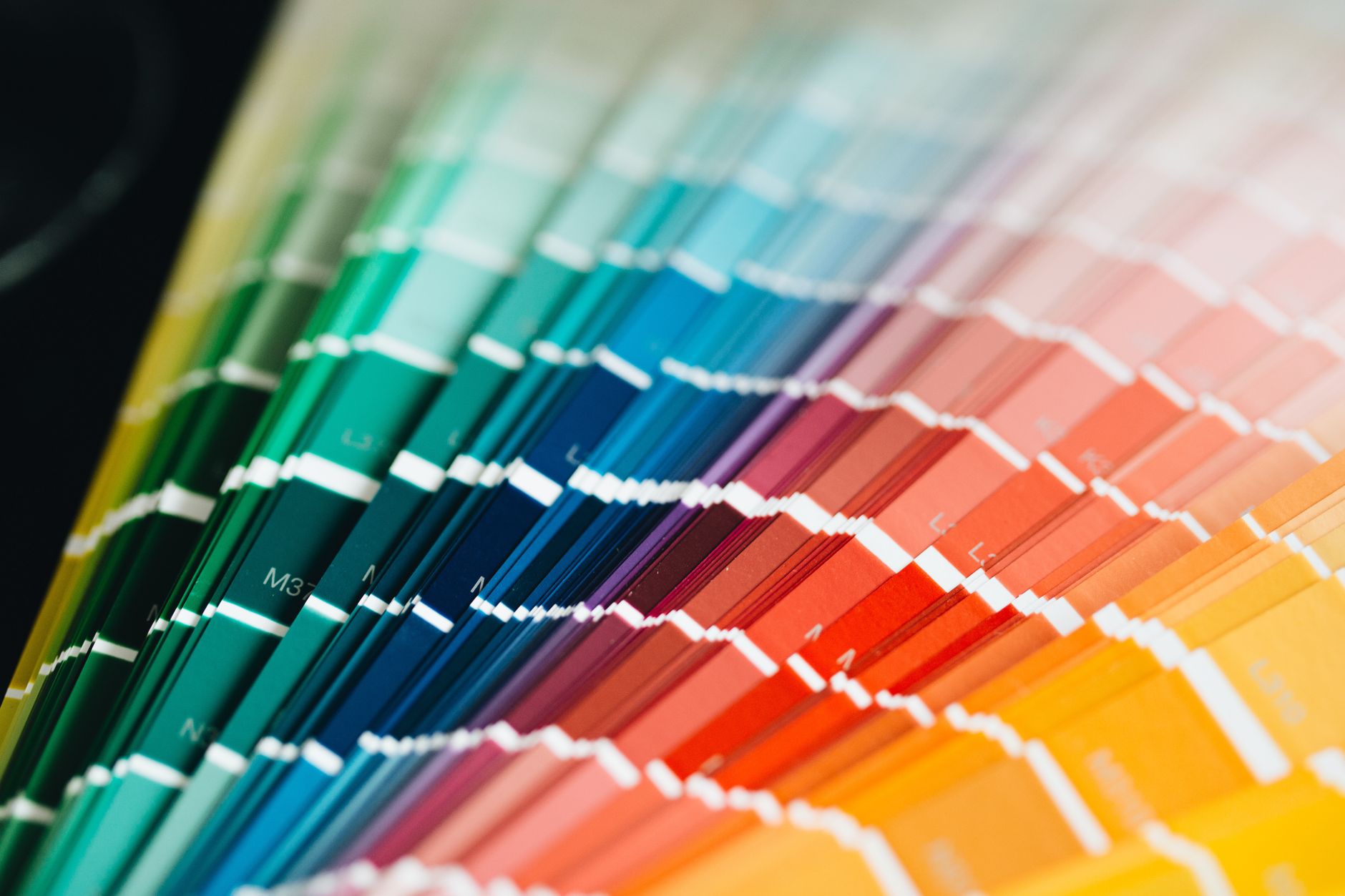
Color psychology is the study of how colors affect human behavior and emotions. In UI design, colors can convey messages, evoke feelings, and guide user actions. Understanding the psychological impact of colors helps in making intentional design choices that align with your app's goals.
How Colors Influence User Perception
- Blue: Evokes trust, security, and professionalism. Commonly used in finance and healthcare apps.
- Green: Associated with growth, health, and nature. Ideal for eco-friendly or wellness apps.
- Red: Creates urgency, excitement, or danger. Used for call-to-action buttons or sale notifications.
- Yellow: Stimulates optimism and attention. Effective for highlights or warnings.
- Purple: Signifies luxury, creativity, and wisdom. Suitable for beauty or creative tools.
- Orange: Energizes and encourages action. Often used for subscribe buttons.
- Neutral colors (white, gray, black): Provide balance and clarity; black adds sophistication, white implies simplicity.
Practical Application in FlutterFlow
When selecting a color palette for your FlutterFlow app, start with your brand identity. If your business is a FlutterFlow agency, you might choose blue to convey trust and expertise. Use FlutterFlow’s theme settings to define primary, secondary, and surface colors. Apply these consistently across buttons, backgrounds, and text to create a cohesive experience. For example, a meditation app could use calming greens and blues, while an e-commerce app might use vibrant reds for sale banners.
Best Practices for Choosing FlutterFlow Color Schemes
Selecting the right color scheme involves more than picking a favorite hue. It requires understanding color theory and applying it to enhance usability.
Color Harmony Techniques
- Complementary: Colors opposite each other on the color wheel (e.g., blue and orange) create high contrast and visual interest. Use one as primary and the other for accents.
- Analogous: Colors next to each other (e.g., blue, teal, green) produce a soothing, harmonious look. Ideal for monothematic apps.
- Triadic: Three evenly spaced colors (e.g., red, yellow, blue) offer vibrant balance. Use sparingly to avoid chaos.
Accessibility and Contrast
Ensure sufficient contrast between text and background for readability. The Web Content Accessibility Guidelines (WCAG) recommend a contrast ratio of at least 4.5:1 for normal text. FlutterFlow’s built-in accessibility checker can help you test contrast. For example, if your primary background is light gray, use dark text (e.g., #333333) rather than light text. Avoid using color alone to convey information—pair with icons or labels.
Brand Consistency
Align color choices with your brand values. A FlutterFlow agency might use a palette that reflects innovation (blue and purple) and reliability (gray). Create a brand style guide within FlutterFlow by defining color variables. This ensures consistency across screens and simplifies maintenance.
Typography Guidelines for FlutterFlow Applications
Typography involves selecting fonts, sizes, and spacing to improve readability and convey tone. Good typography can make an app feel professional and trustworthy.
Font Selection Principles
- Serif vs. Sans-serif: Serif fonts (e.g., Times New Roman) suggest tradition and formality; sans-serif (e.g., Roboto, Open Sans) feel modern and clean. For digital screens, sans-serif is generally preferred due to better readability.
- Font Pairing: Combine a heading font with a body font that complements each other. For example, pair a bold sans-serif for headings with a lighter sans-serif for body text.
- Brand Alignment: Choose fonts that reflect your brand personality. A playful app might use rounded fonts like Nunito, while a corporate app might use straightforward fonts like Inter.
Sizing and Spacing
- Hierarchy: Establish a clear hierarchy using different sizes for headings, subheadings, and body text. For example, H1 at 32px, H2 at 24px, body at 16px.
- Line Height: Set line height to 1.5–1.6 times the font size for optimal readability.
- Letter Spacing: Avoid too-tight or too-loose spacing. Normal spacing (0.5px to 1px) is standard for body text.
Implementation in FlutterFlow
FlutterFlow allows you to define typography styles globally. Under Theme > Typography, set default fonts for body, headline, caption, etc. Use the prebuilt theme or customize with Google Fonts. For instance, set your headline style to 'Poppins Bold' and body to 'Roboto Regular'. Ensure text styles are consistent across all components.
Integrating Color and Typography with FlutterFlow UI Components
FlutterFlow provides a rich set of UI components—buttons, cards, text fields, etc. Applying color and typography standards to these components ensures a unified interface.
Button Design
- Use your primary color for primary action buttons. If your primary is blue, then ‘Get Started’ buttons should be blue.
- Ensure button text contrasts well with button background. White text on blue works well.
- Maintain consistent padding and font size across buttons.
Cards and Containers
- Use surface colors (e.g., white or light gray) for cards. Elevation with shadows adds depth.
- Apply body text style for card content; headings should be slightly larger.
- For emphasis, use accent colors or bold fonts sparingly.
Forms and Input Fields
- Borders and labels should be clear. Use secondary colors for inactive states (e.g., gray border) and primary for active/focused states (e.g., blue border).
- Error messages use red, but ensure readability by providing icon support.
Navigation Bars and Tabs
- Use a dark primary color or surface color for navbar background. Icon and label colors should contrast.
- Active tab can be highlighted with primary color; inactive tabs use gray.
Case Study: Redesigning a Fitness App in FlutterFlow
Let’s consider an online fitness app that needed better engagement. Initial design used red and black, which felt aggressive. We shifted to a palette of energetic orange and calm gray. Typography changed from condensed fonts to rounded sans-serif for approachability. In FlutterFlow, we adjusted theme colors and font styles globally. Post-redesign, user retention increased by 20% and session times doubled. Key changes:
- Color: Orange for CTAs, gray for backgrounds, white for text.
- Typography: Nunito for headings, Open Sans for body.
- Implementation: Used FlutterFlow’s Theme Editor to apply new colors and fonts across all screens.
This example shows how thoughtful color and typography choices can directly impact business metrics.
The Role of Color and Typography in Conversion Optimization
Effective color and typography can guide users toward desired actions, such as signing up or making a purchase.
Call-to-Action (CTA) Optimization
- Use contrasting colors for CTAs to draw attention. If your primary color is blue, a contrasting orange button stands out.
- Typography should be clear and compelling: use action-oriented words like “Get Started” with bold weight.
- A/B testing can reveal optimal color combinations. For instance, testing a green vs. blue button might show green yields more clicks.
Readability and Trust
- Poor typography reduces credibility. Ensure text is large enough (minimum 16px for body) and legible.
- Use warm colors to evoke trust in financial apps; cool colors for healthcare.
- Consistent branding across screens builds familiarity and reduces cognitive load.
Speed and Performance
- FlutterFlow selects optimized fonts, but avoid excessive font families. Two fonts (heading and body) are sufficient.
- Use system fonts (Roboto on Android, SF Pro on iOS) for better performance, or use web-safe fonts from Google Fonts.
Common Mistakes to Avoid with FlutterFlow Color and Typography
Even experienced designers can fall into traps. Here are pitfalls to avoid:
Overusing Colors
- Using too many colors creates visual noise. Stick to a primary, secondary, and accent color. Use neutrals for backgrounds.
- Example: Avoid using red for both errors and primary buttons.
Poor Contrast
- Light gray text on white background is unreadable. Always test contrast ratios.
- In FlutterFlow, use the ‘Contrast Checker’ tool in the Theme panel.
Inconsistent Typography
- Mixing multiple font families leads to inconsistency. Define a hierarchy and stick to it.
- For instance, do not use two different serif fonts for headings.
Ignoring Device Variations
- Text that looks good on desktop may be too small on mobile. Use responsive sizing in FlutterFlow: percentage-based widths and adaptive font sizes.
- For more on responsive design, see our guide on Best Practices for Responsive UI Design in FlutterFlow Mobile Apps.
Neglecting Accessibility
- Colorblind users may not differentiate red/green. Use patterns or icons alongside color.
- Ensure touch targets are at least 48x48 dp for accessibility.
Tools and Resources for FlutterFlow Color and Typography Design
Leverage external tools to refine your choices:
- Coolors.co: Generate harmonious color palettes.
- Google Fonts: Extensive library of free fonts; FlutterFlow integrates directly.
- Contrast Checker: WCAG tools to verify contrast.
- Adobe Color: Create and export color themes.
In FlutterFlow, use the built-in theme editor to apply these choices quickly. You can also import themes from design tools like Figma.
Testing and Iterating Your Design Choices
Data-driven design ensures your interface resonates with users.
A/B Testing Colors and Fonts
- Use FlutterFlow’s variant testing (with custom code or analytics) to test different color schemes.
- Test one element at a time: for example, compare a blue primary button vs. a green one.
Heatmaps and User Feedback
- Tools like Hotjar can show where users click, revealing if CTAs are noticed.
- Gather qualitative feedback through surveys. For instance, ask users if they find the app easy to read.
Performance Metrics
- Monitor conversion rates, time on page, and bounce rates after changes.
- For check-optimized typography, track if users scroll further or complete forms.
The Future of Color and Typography in FlutterFlow Apps
As design trends evolve, staying ahead enhances user experience. Current trends include:
- Dark Mode: Provide an option for dark color schemes. FlutterFlow supports adaptive theming.
- Variable Fonts: Single font files with multiple weights reduce load time.
- Micro-interactions: Animated color transitions (e.g., button hover effects) improve engagement.
- Minimalism: Clean designs with ample whitespace and limited color palette.
FlutterFlow’s ever-growing capabilities make it easier to implement these trends while maintaining performance.
Conclusion
Mastering color psychology and typography is essential for creating compelling FlutterFlow app interfaces. By understanding how colors influence emotions and behaviors, and applying typography principles for readability and hierarchy, you can build apps that not only look professional but also drive user action. Remember to:
- Choose color schemes that reflect brand values and enhance accessibility.
- Select fonts that are legible and consistent across devices.
- Integrate these choices with FlutterFlow’s theme system for efficiency.
- Continuously test and iterate based on user feedback and analytics.
For further insights on designing responsive FlutterFlow apps, check out our article on Best Practices for Responsive UI Design in FlutterFlow Mobile Apps. Applying these strategies will elevate your app’s user experience and help you achieve your business goals.